Centelles & Morgan
independent judgment, by design
Overview
A conceptual law-firm website built around editorial typography, architectural imagery and a clear connection between expertise and the people behind it.
Trust, without the corporate clichés
Centelles & Morgan is a fictional independent law firm. This self-initiated case explores how a legal practice can express authority without grand claims, generic imagery or an impersonal list of services.
I designed and built a complete editorial system: identity, page hierarchy, connected content and a restrained motion language. The firm, partner profiles and matters are demonstration content, not a commercial client engagement.
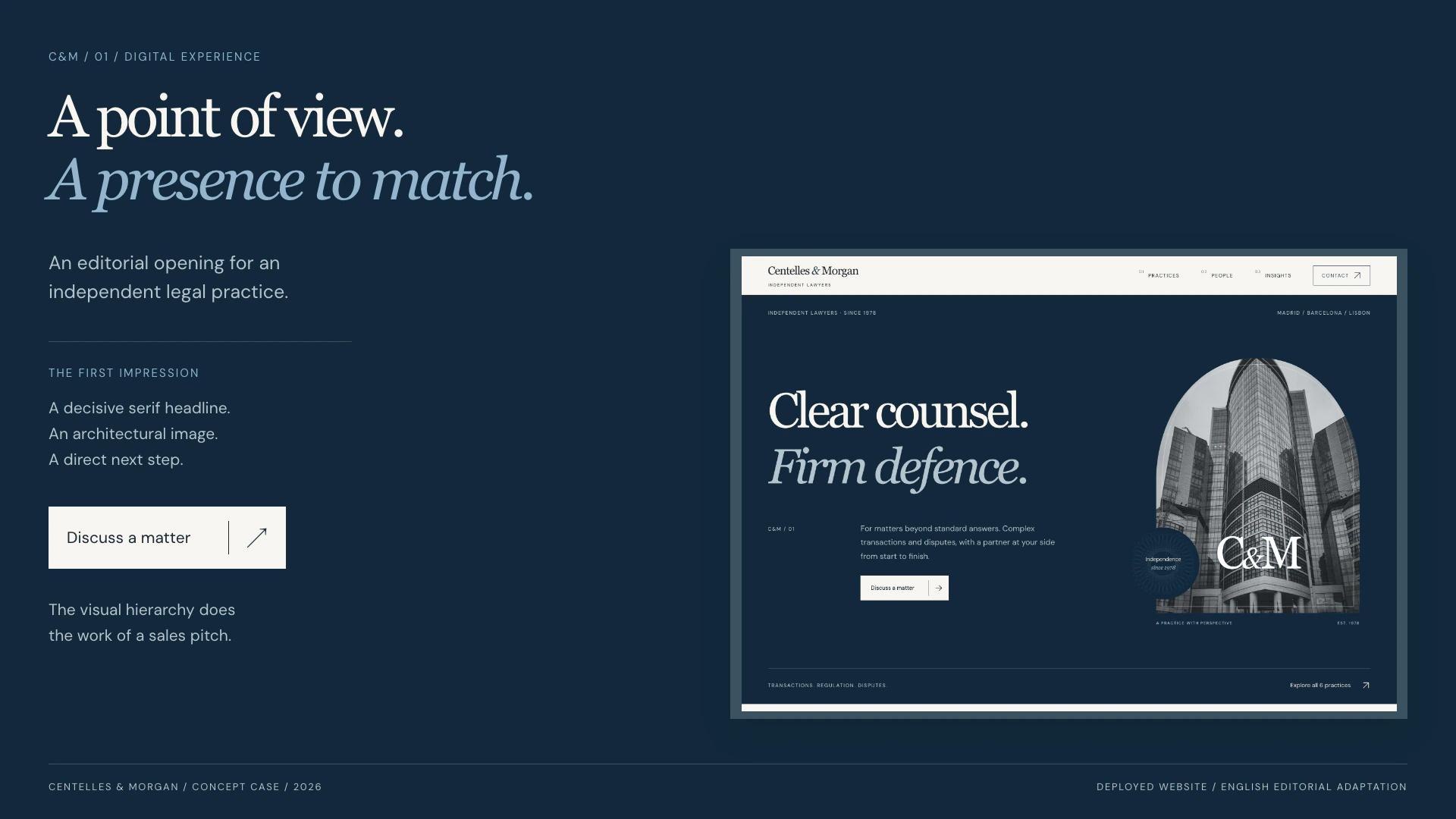
The design system
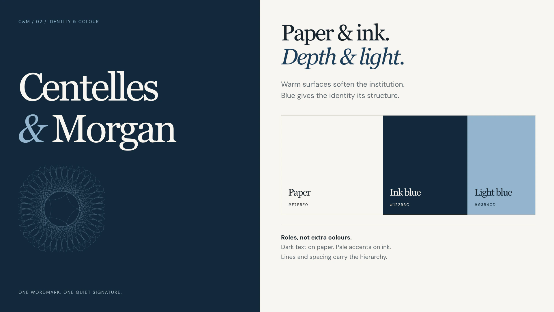
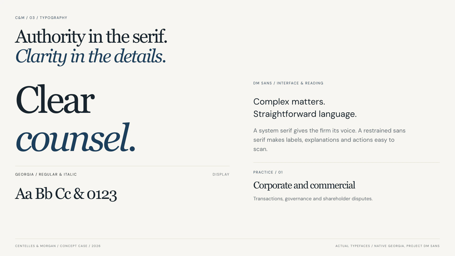
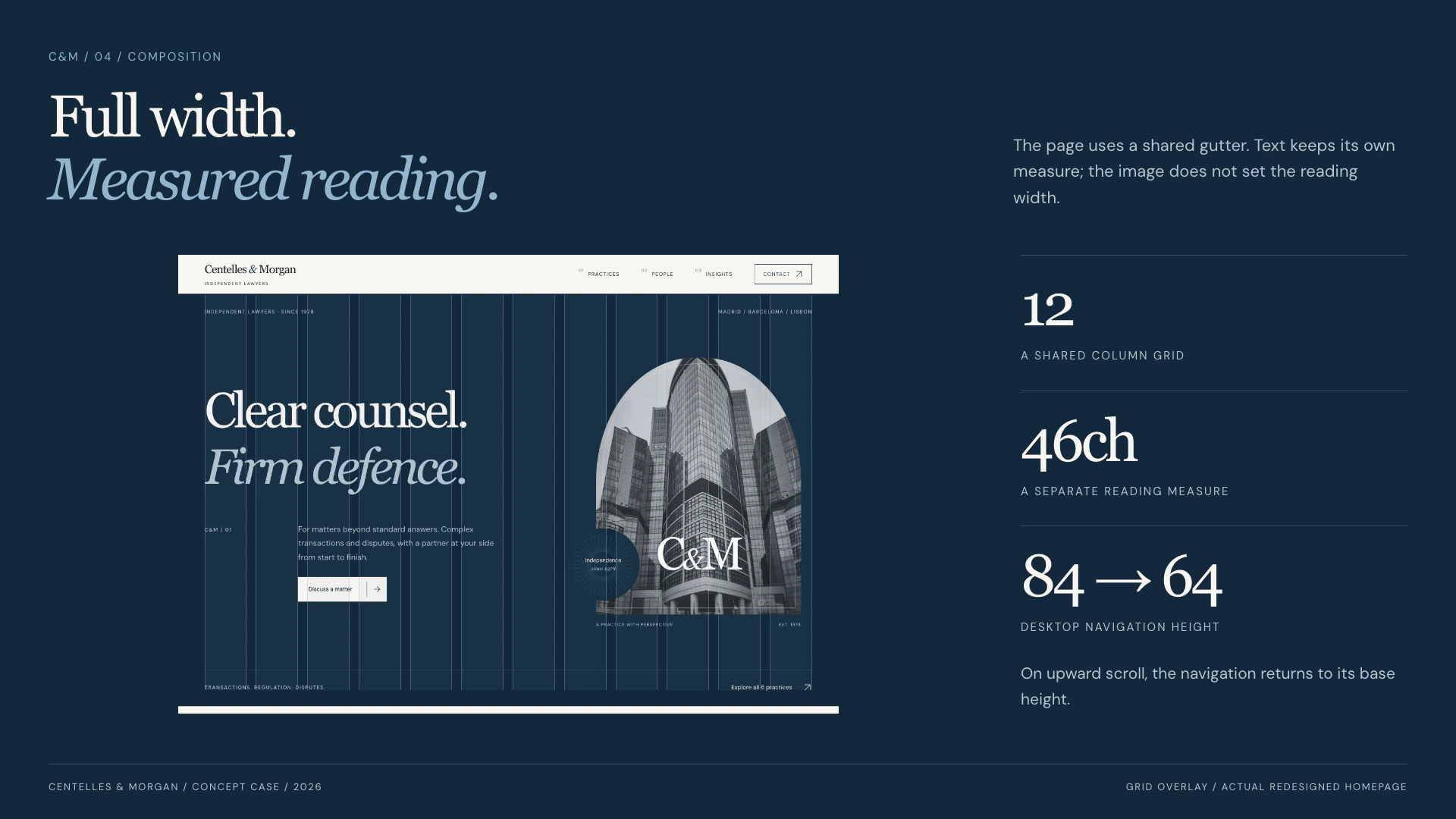
Seven plates: identity and colour, typography, composition, components, content architecture, photography and motion. The graphics use the source typefaces, colours and imagery.
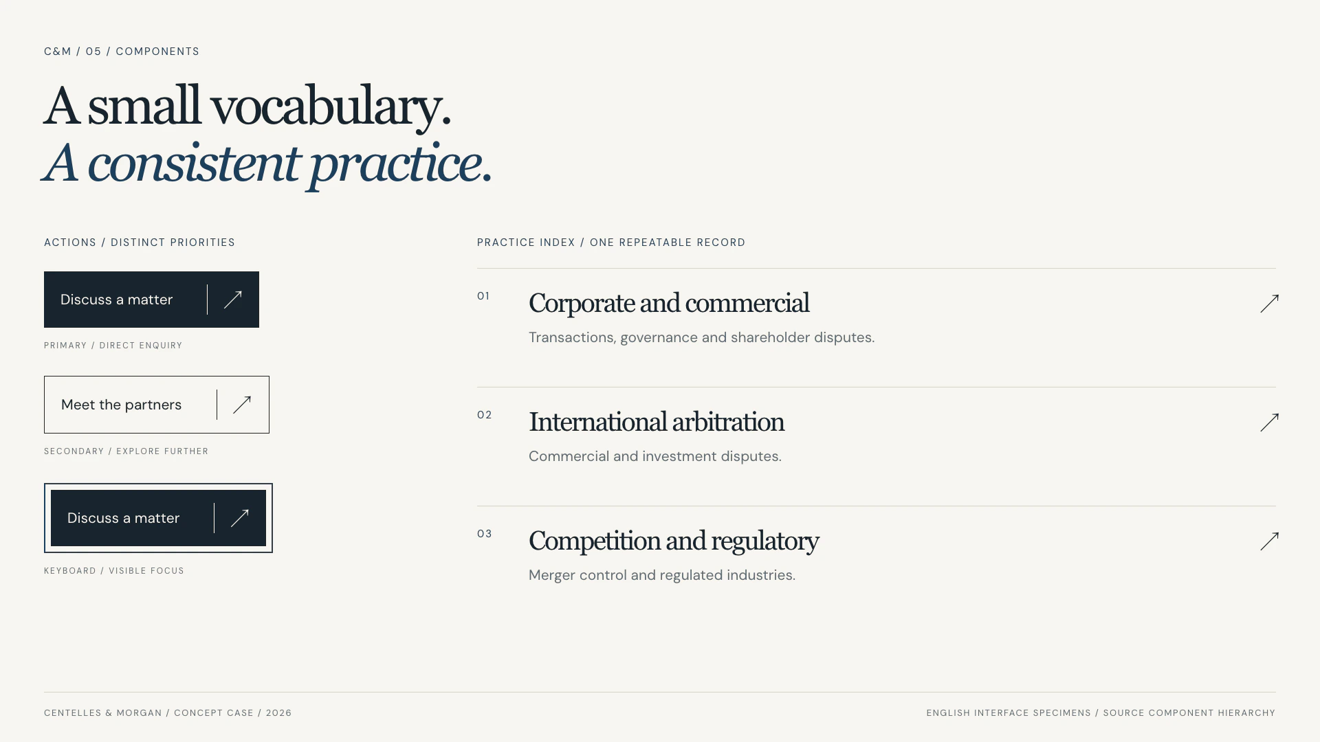
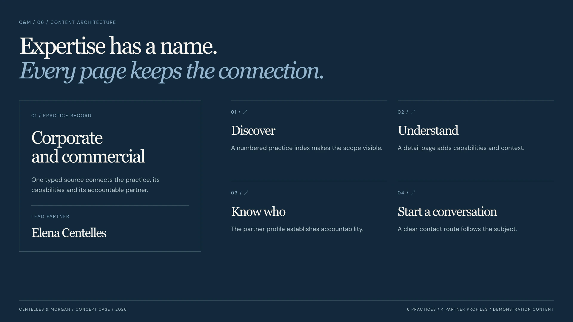
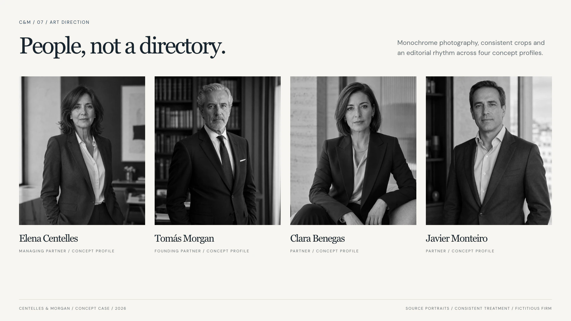
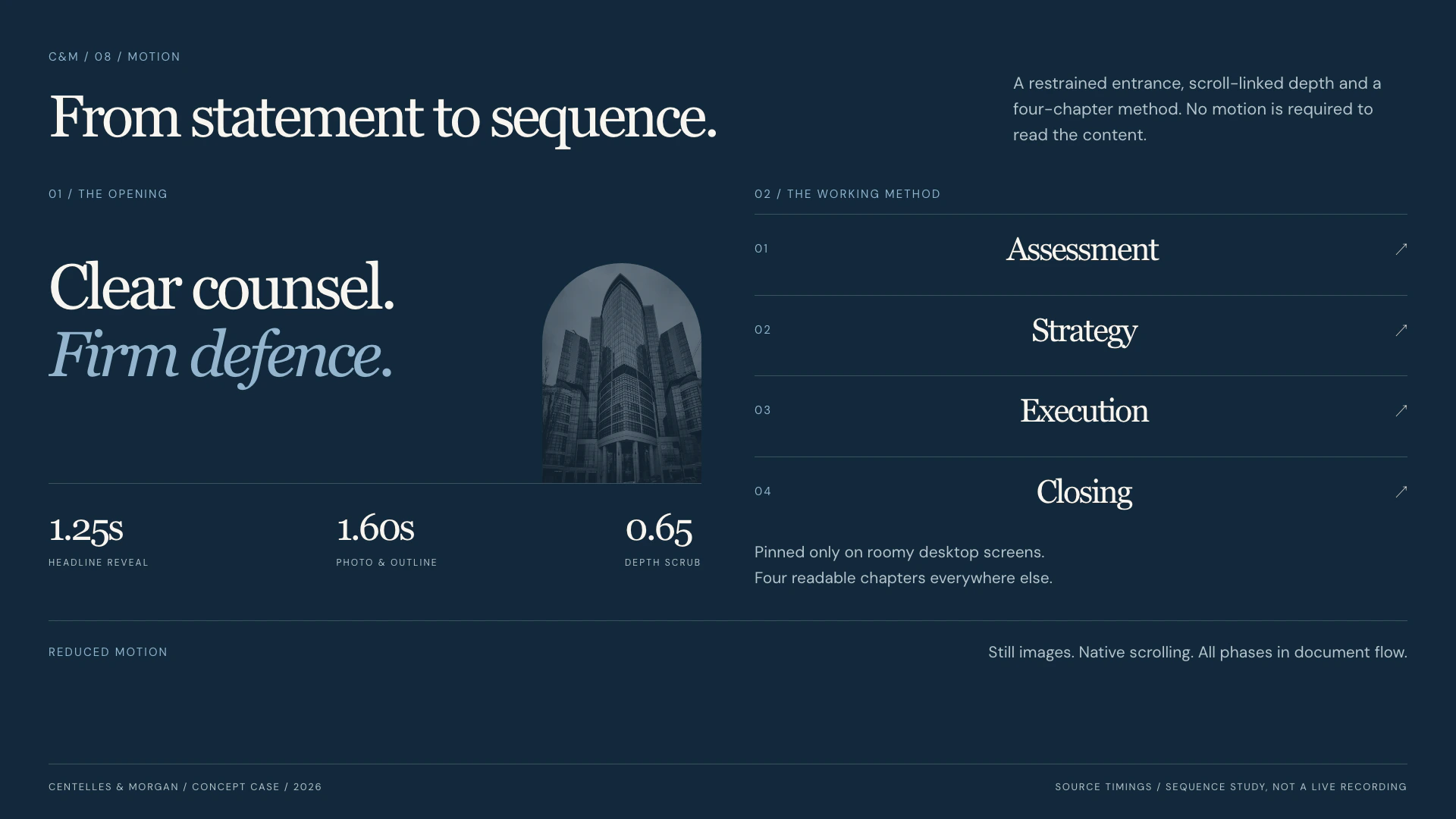
Expertise stays connected to people
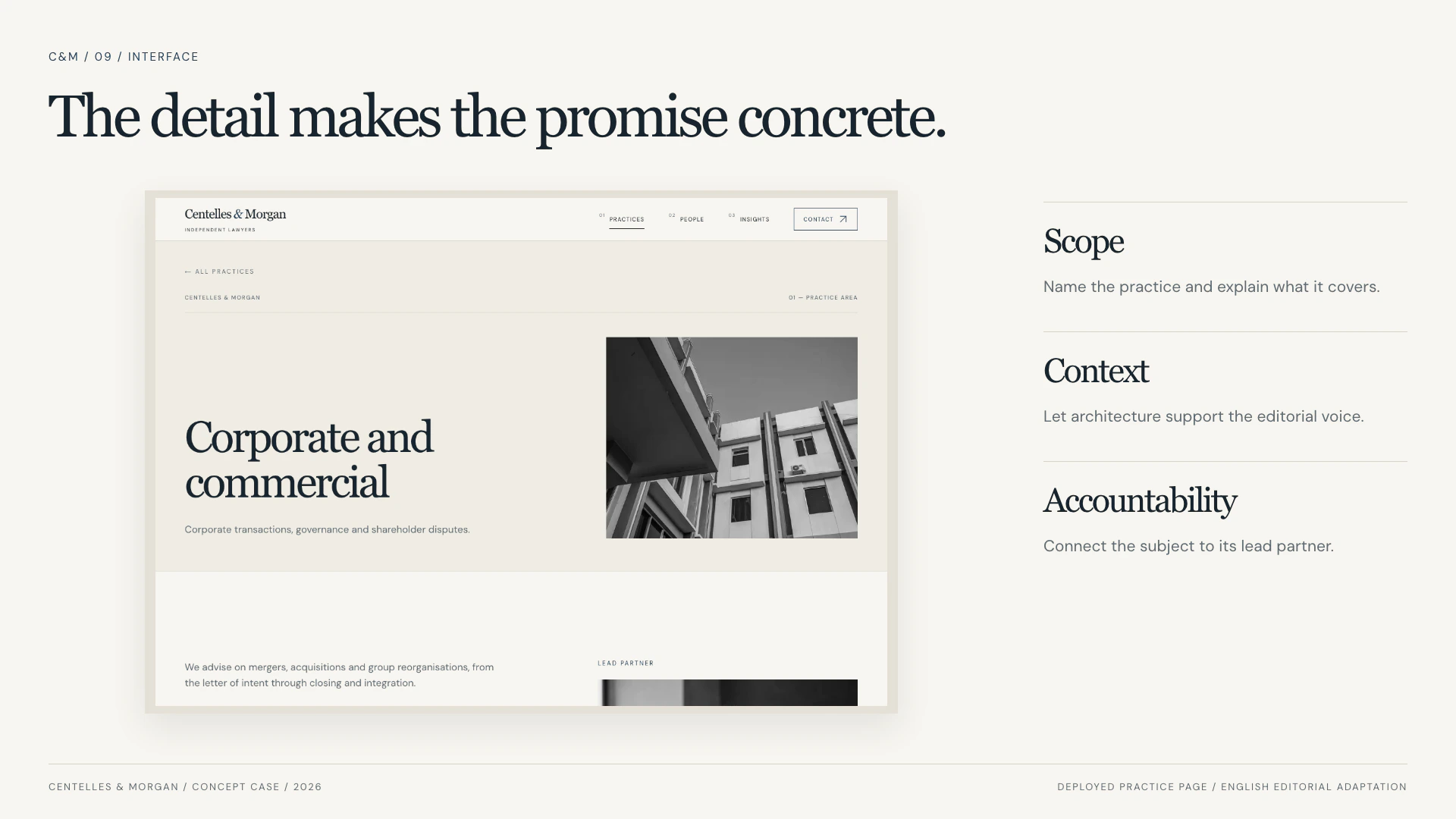
The practice index leads into focused detail pages: scope, capabilities, context and a responsible partner. Shared content supplies the indexes, profiles and related links, so the experience keeps one vocabulary as the reader moves deeper.
The design gives each page a clear next step. Contact forms demonstrate the interaction without pretending to deliver a real enquiry.
From overview to a specific practice
The same source layout and typography continue into the detail pages. English editorial export of the published prototype.
Motion establishes a reading rhythm
The opening sequences the headline, photograph and drawn outline. Scrolling adds depth to separate image and type layers; the manifesto strengthens word by word. The navigation contracts on downward scroll and expands on the way back.
A four-chapter method scene is pinned only on sufficiently large desktop viewports. On smaller screens and with reduced motion, every phase remains in normal document flow. The portfolio hover clip is a separate four-second presentation, not a recording of those interactions.
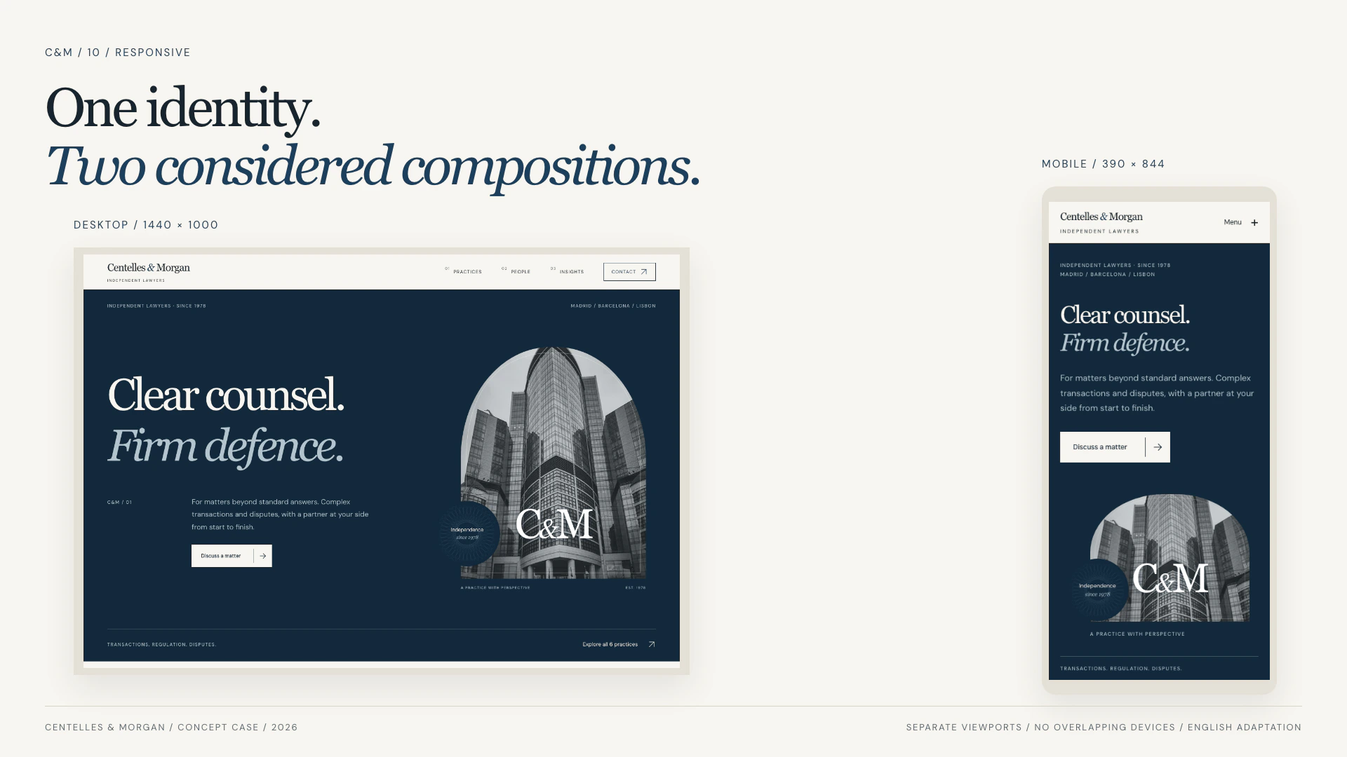
One identity, on web and mobile
Desktop and mobile viewports are presented separately. The navigation, text measure and image arrangement adapt without hiding the central message.
What the prototype includes
A complete visual and interaction system
The result is a navigable prototype with a consistent institutional voice: Georgia gives the identity its character, DM Sans keeps functional content direct, and the paper-and-ink palette links every page.
The case demonstrates design and implementation, not business results. No conversion, revenue or client-performance claims are attributed to this fictional firm.
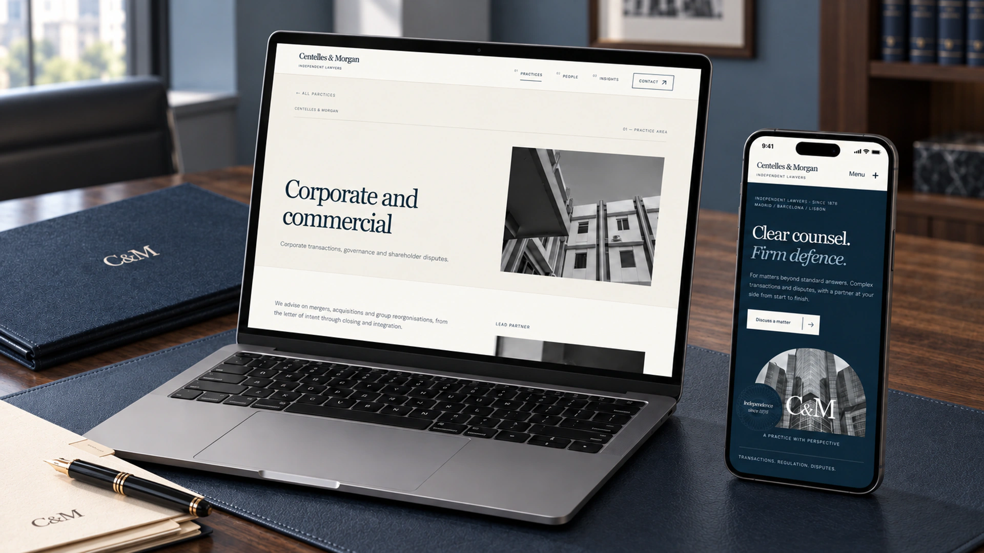
The system in context
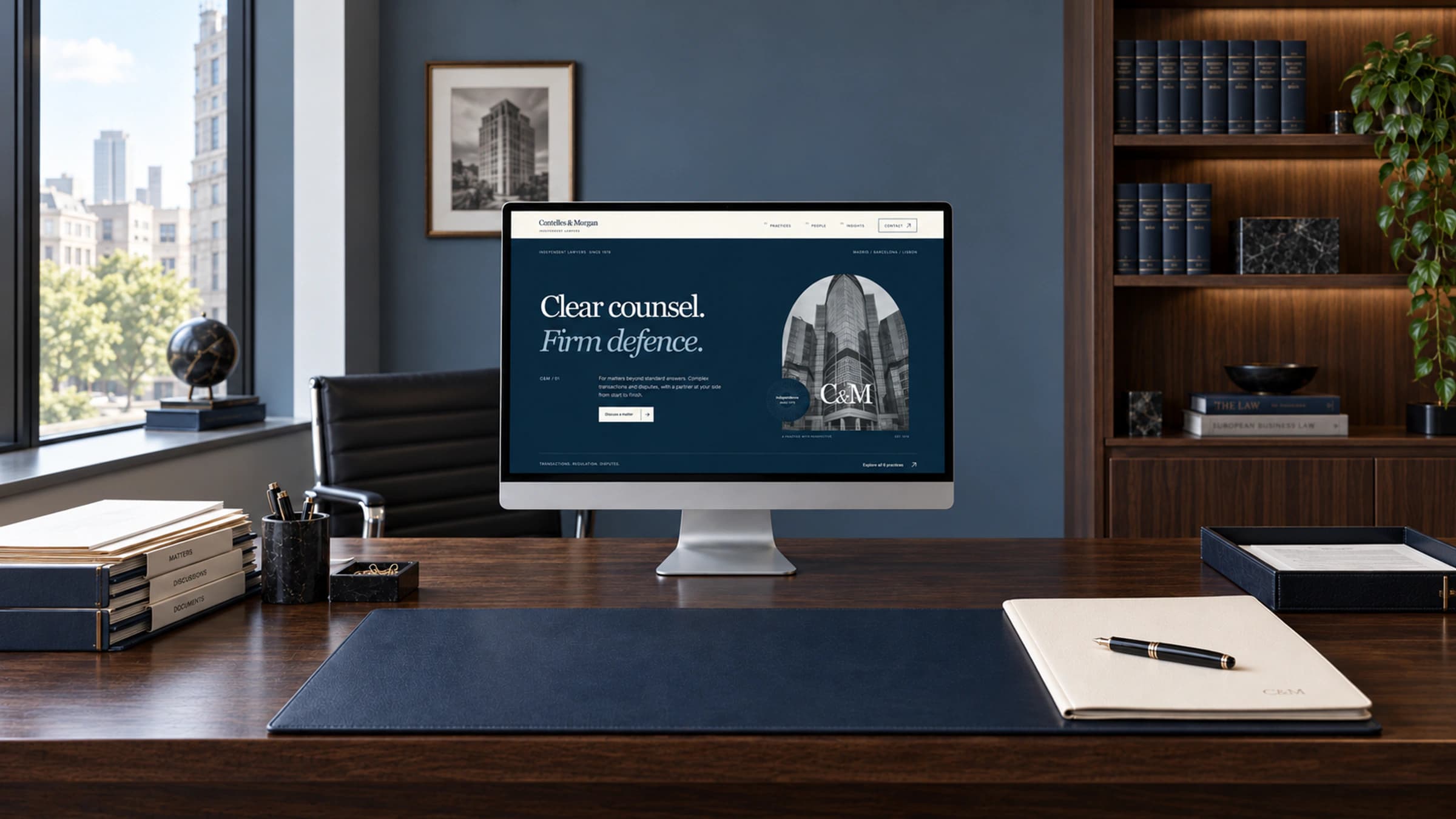
Illustrative legal-office mockups based on the redesigned interface. Generated presentation imagery; not photographs of the firm or its offices.
Live result
Centelles & Morgan