Consta
architecture, made clear
Overview
A conceptual real estate experience pairing a panoramic gallery with a precise comparison system. Stone, petrol and ochre give the interface a material identity; structured information makes the next step clear.
Architecture invites. Information helps decide.
Consta is an independent concept, not a client commission or a real property developer. The brief was to give an architectural brand a distinctive presence while answering the questions behind a visit: what is available, where it is, when it arrives and what it costs.
I developed the identity, information architecture, interface and frontend as one system. The current direction brings a full-width gallery together with a compact, comparative project index.
A material identity, with a precise hierarchy.
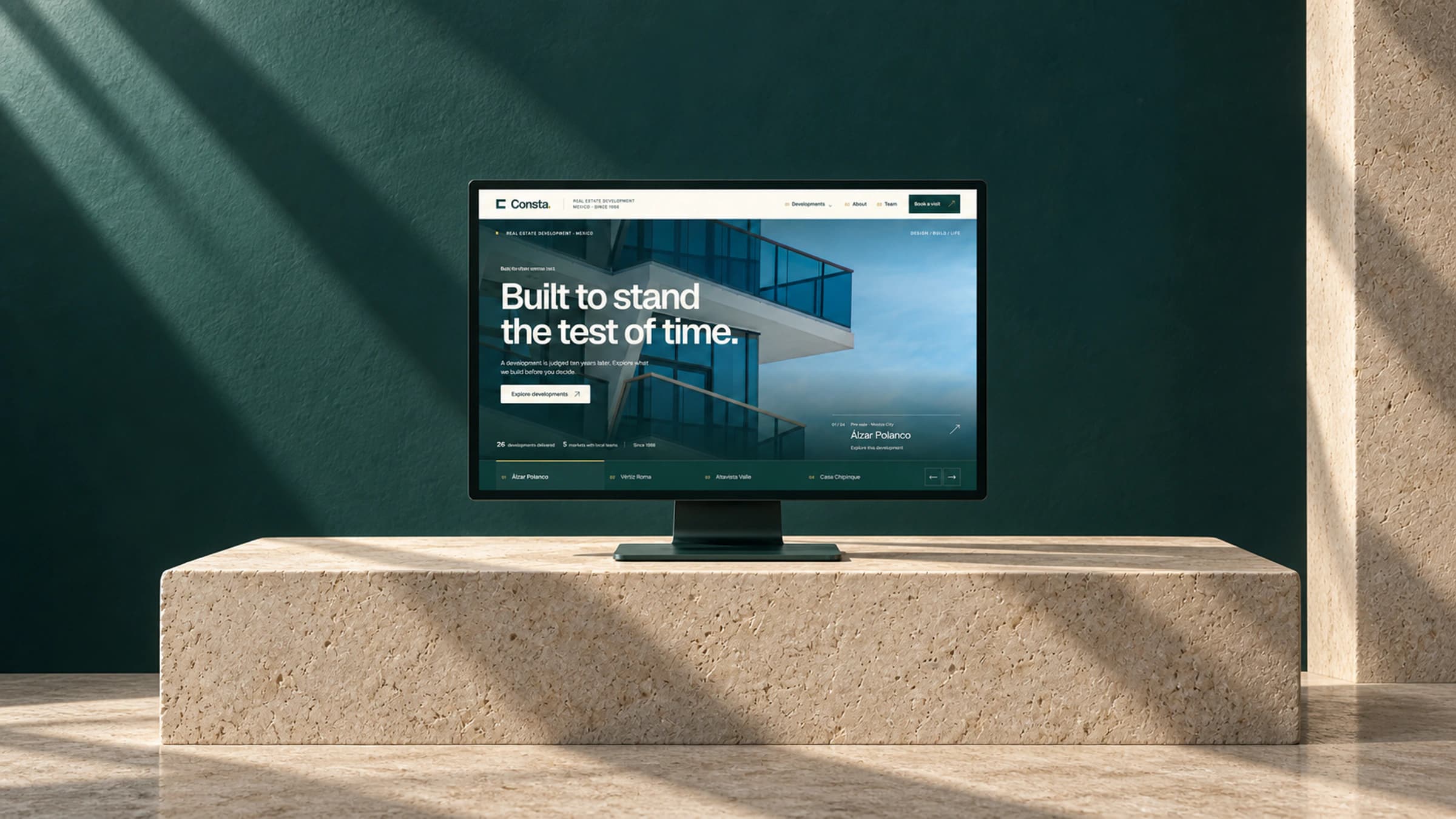
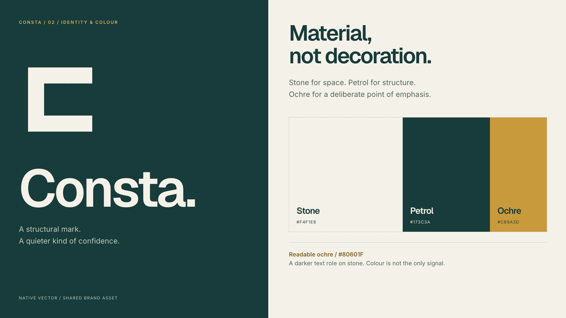
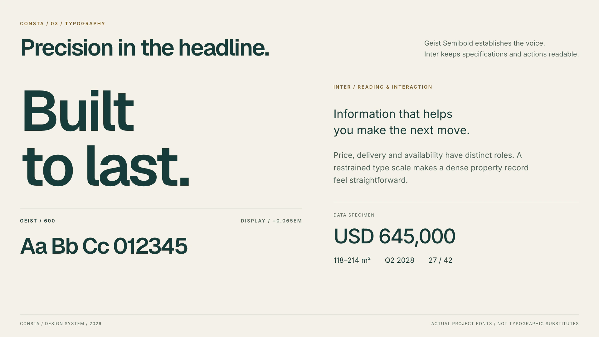
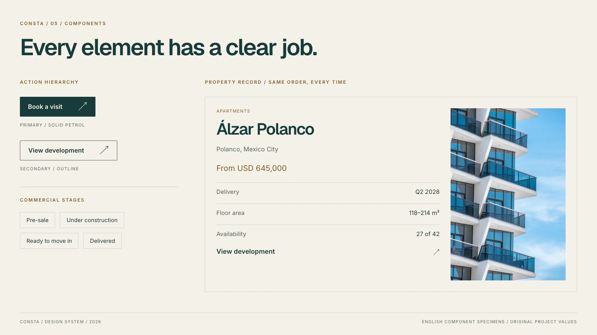
Warm stone creates breathing room. Petrol establishes structure, while ochre marks selection and emphasis. Geist Semibold gives the headlines weight; Inter keeps specifications and controls easy to read.
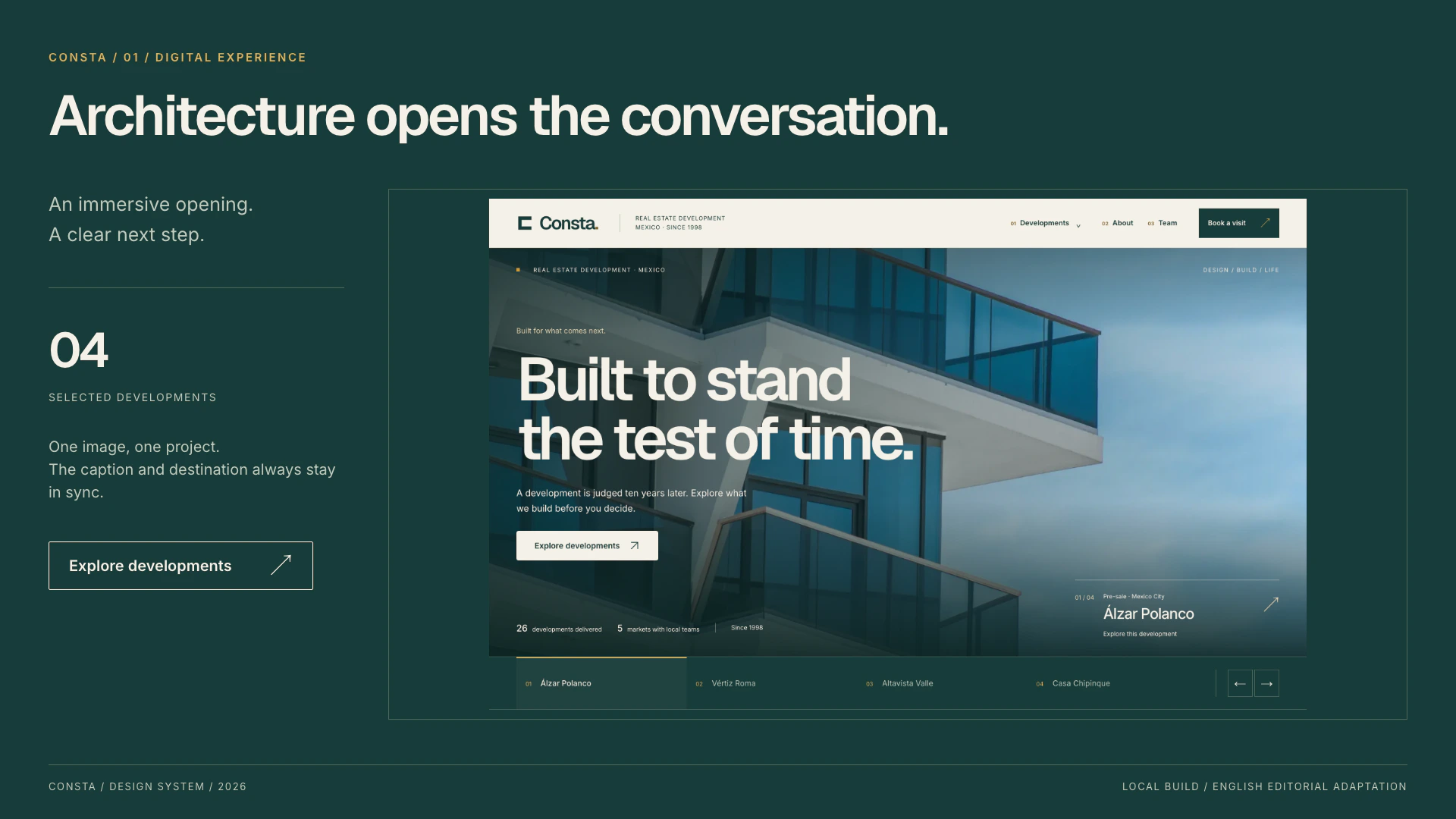
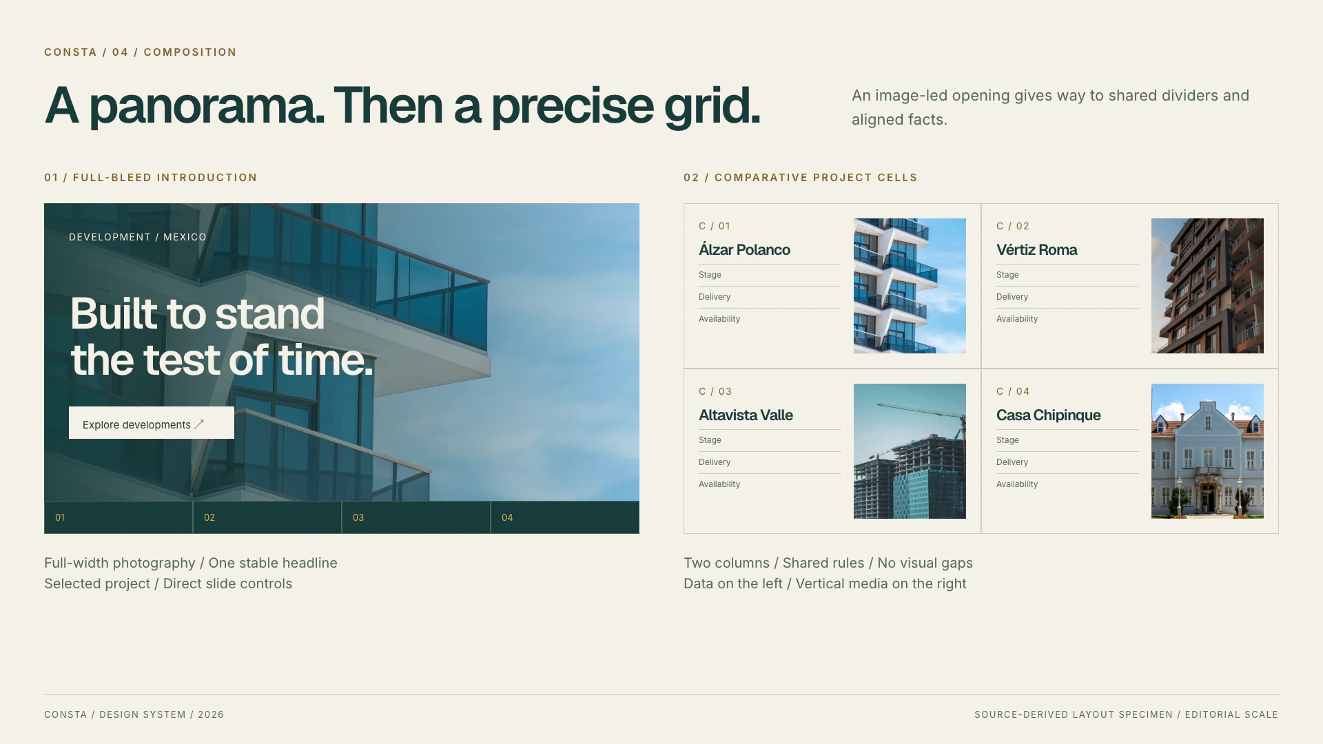
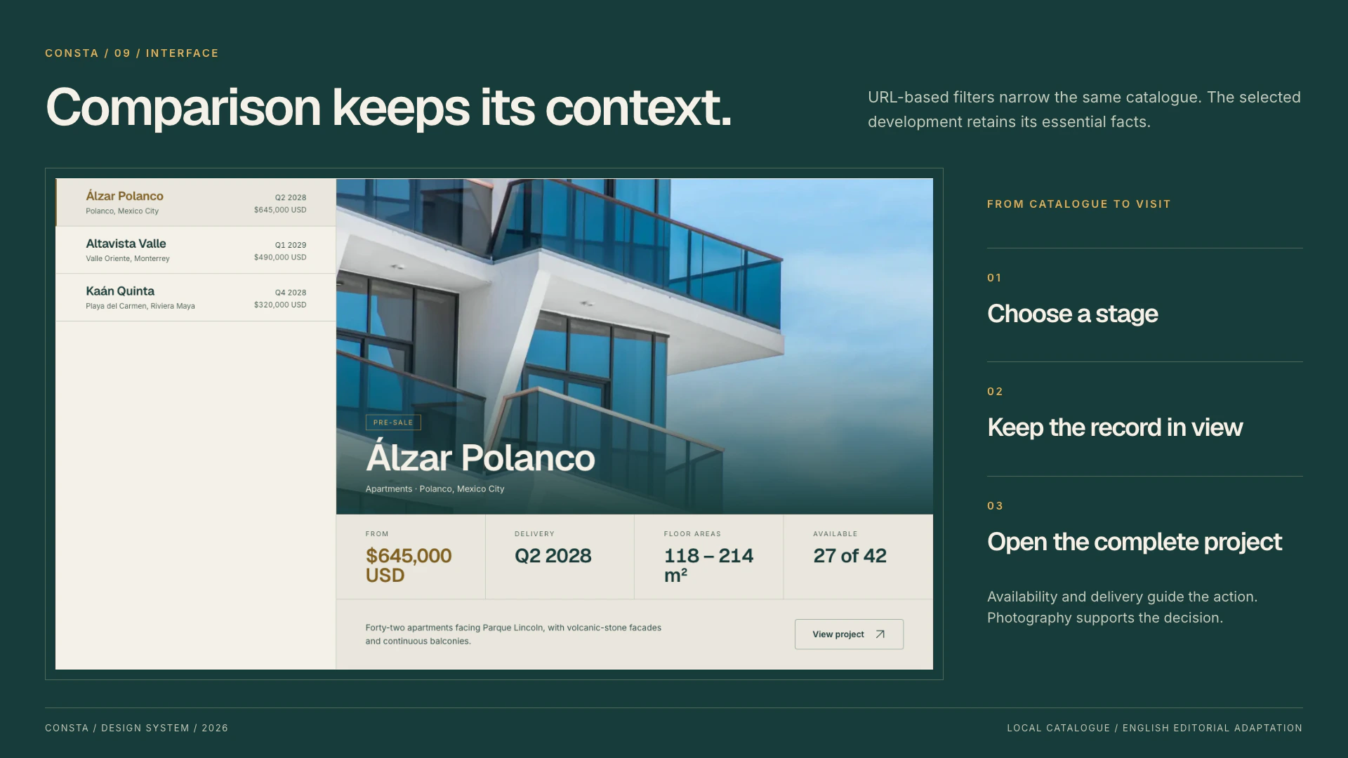
The homepage moves from an immersive image to four aligned project cells. Shared dividers, repeated data fields and a clear action hierarchy let the architecture vary without making visitors relearn the interface.
The design system, in seven studies
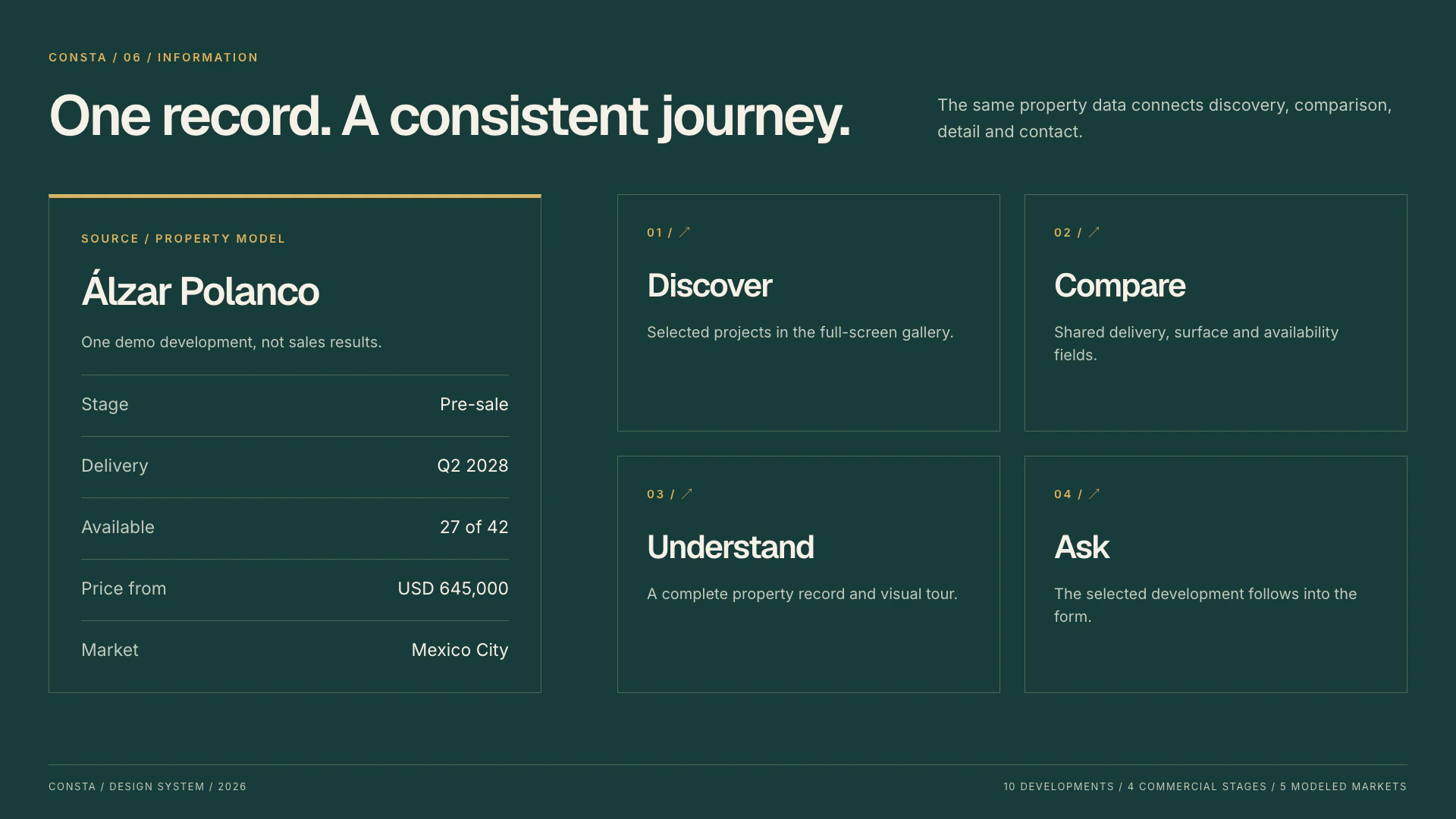
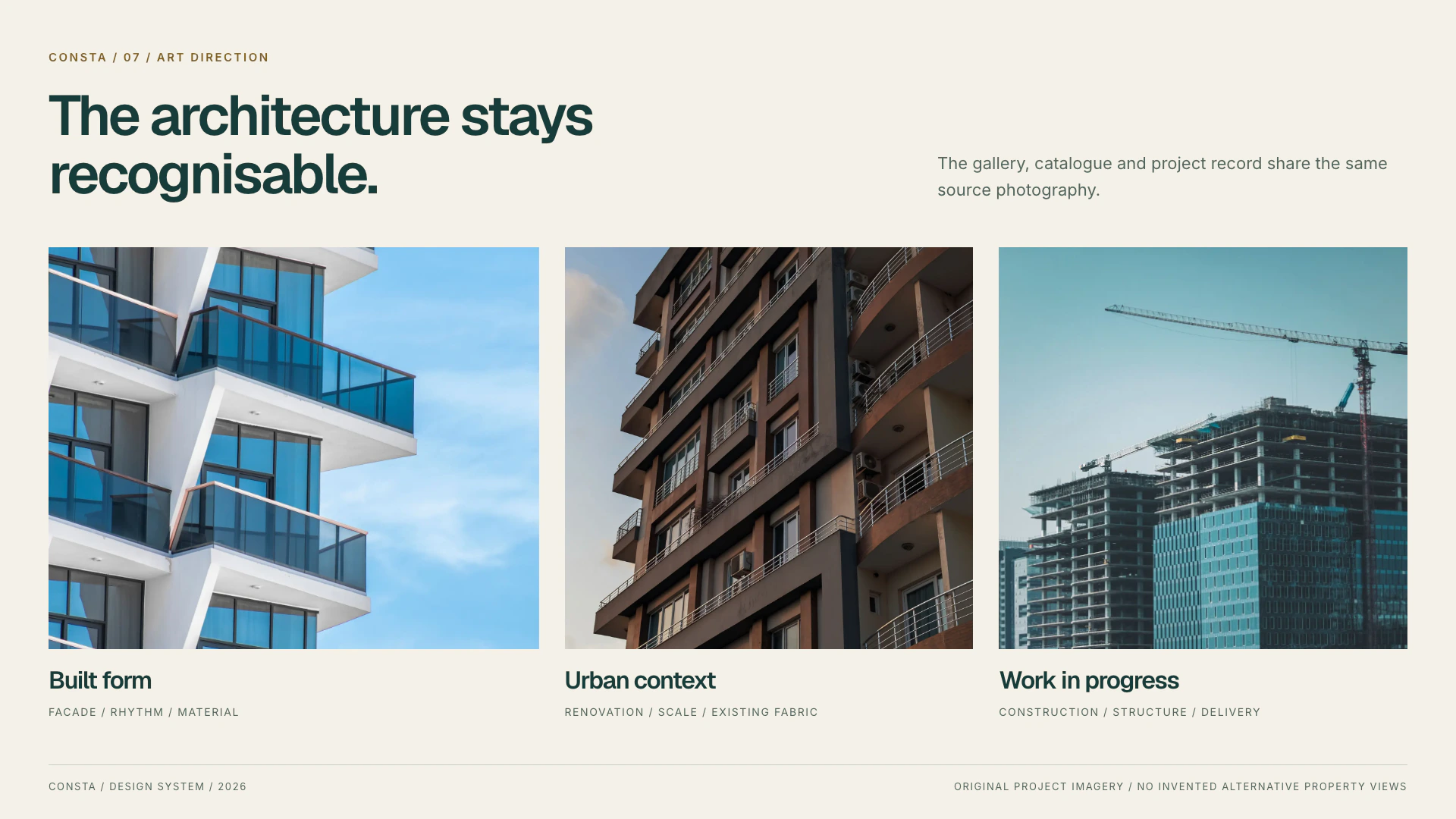
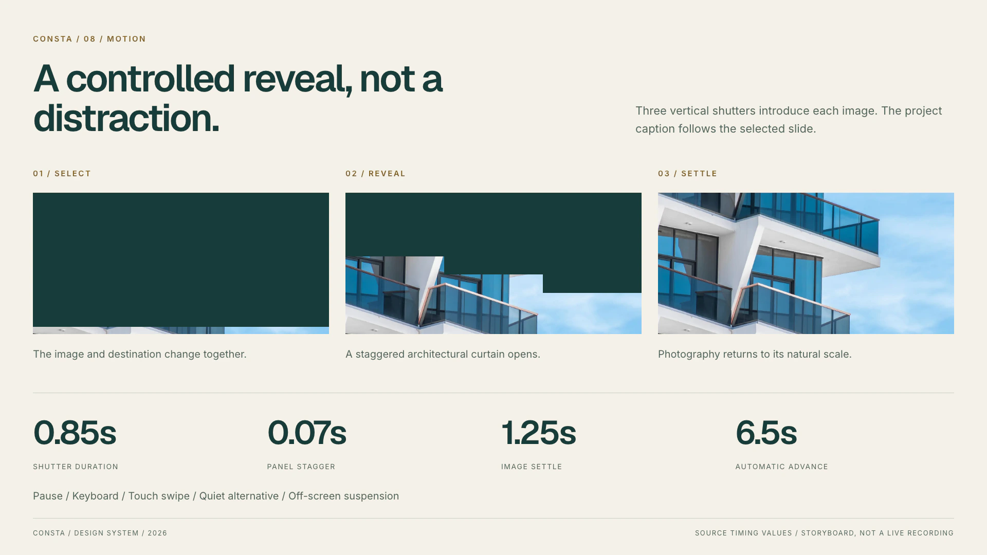
Identity, typography, composition, components, content, image direction and motion. All plate copy is in English; specimens use the actual project fonts, source tokens and demo data.
From discovery to a considered visit.
Ten development records supply the gallery, catalogue, detail pages and contact flow. Stage, delivery, floor area, availability and entry price retain their roles across the journey. URL-based filters narrow the catalogue without losing its context.
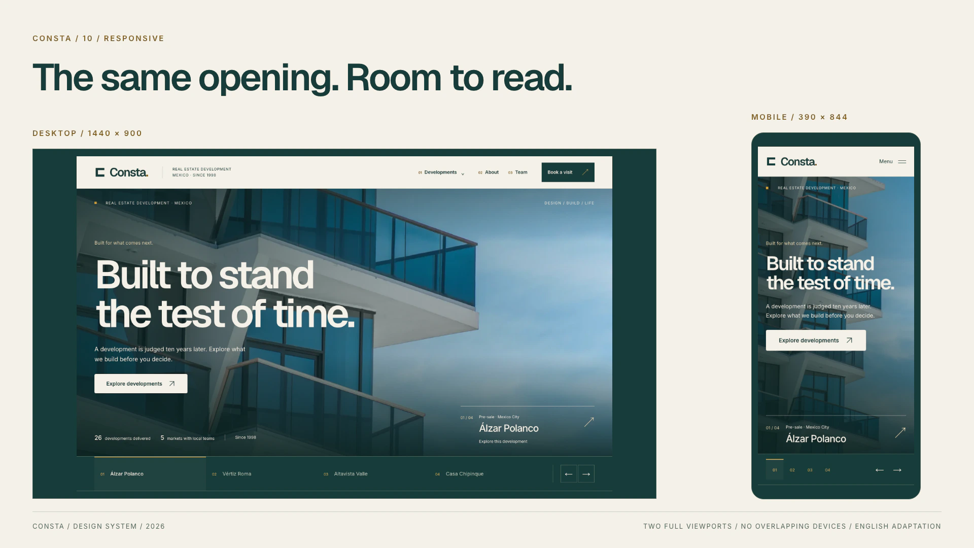
The opening gallery keeps its image, caption and destination in sync. Its shutter transition has direct controls, keyboard and touch navigation, and a quiet alternative for reduced motion.
Two viewports. One clear reading order.
Source-rendered views at 1440 × 900 and 390 × 844. English is an editorial adaptation for the portfolio; the public prototype is in Spanish.
Prototype scope
A complete experience, not a sales claim.
The result is a navigable prototype with a coherent identity, a reusable content model and a consistent path from first impression to enquiry. The work demonstrates design and implementation decisions—not measured conversion, sales results or a real developer’s track record.
Final presentation
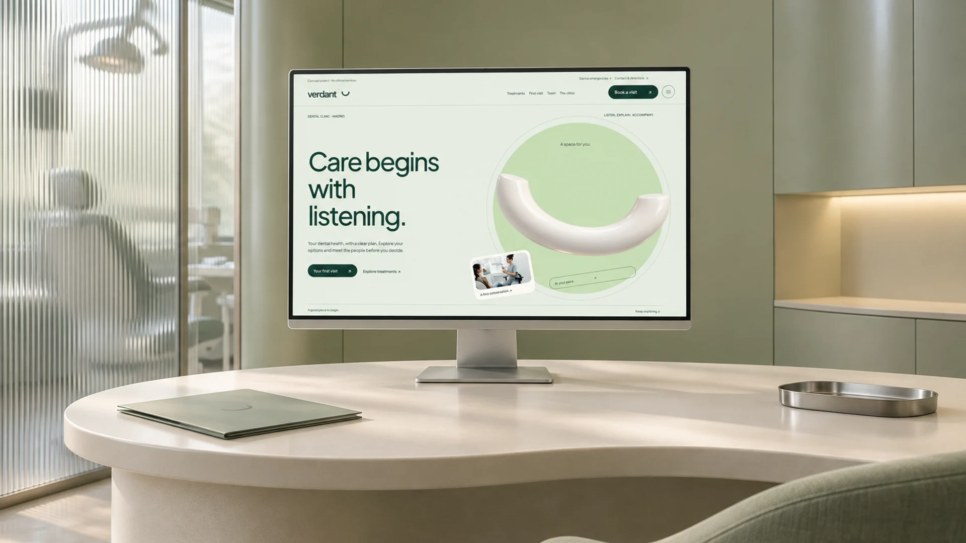
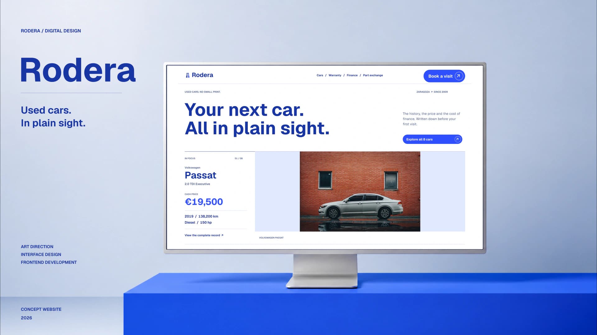
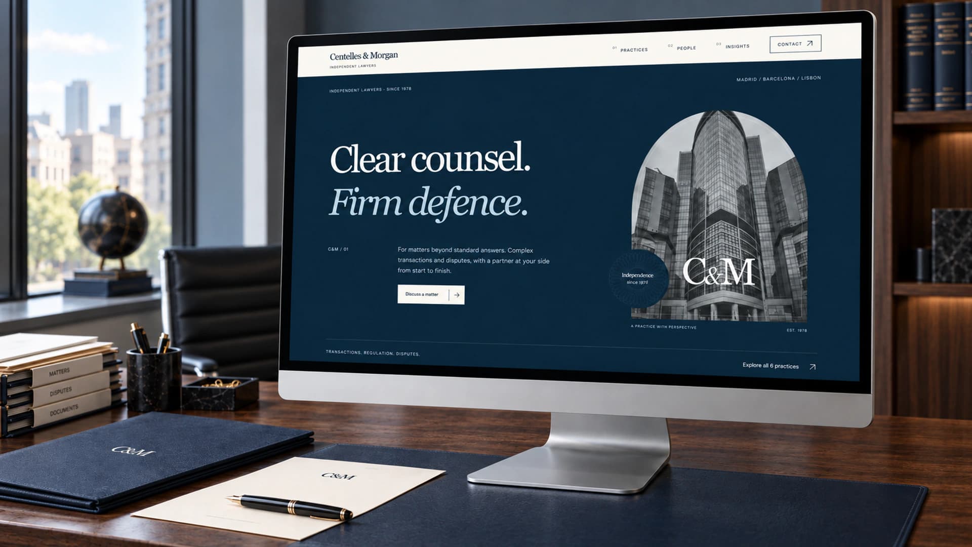
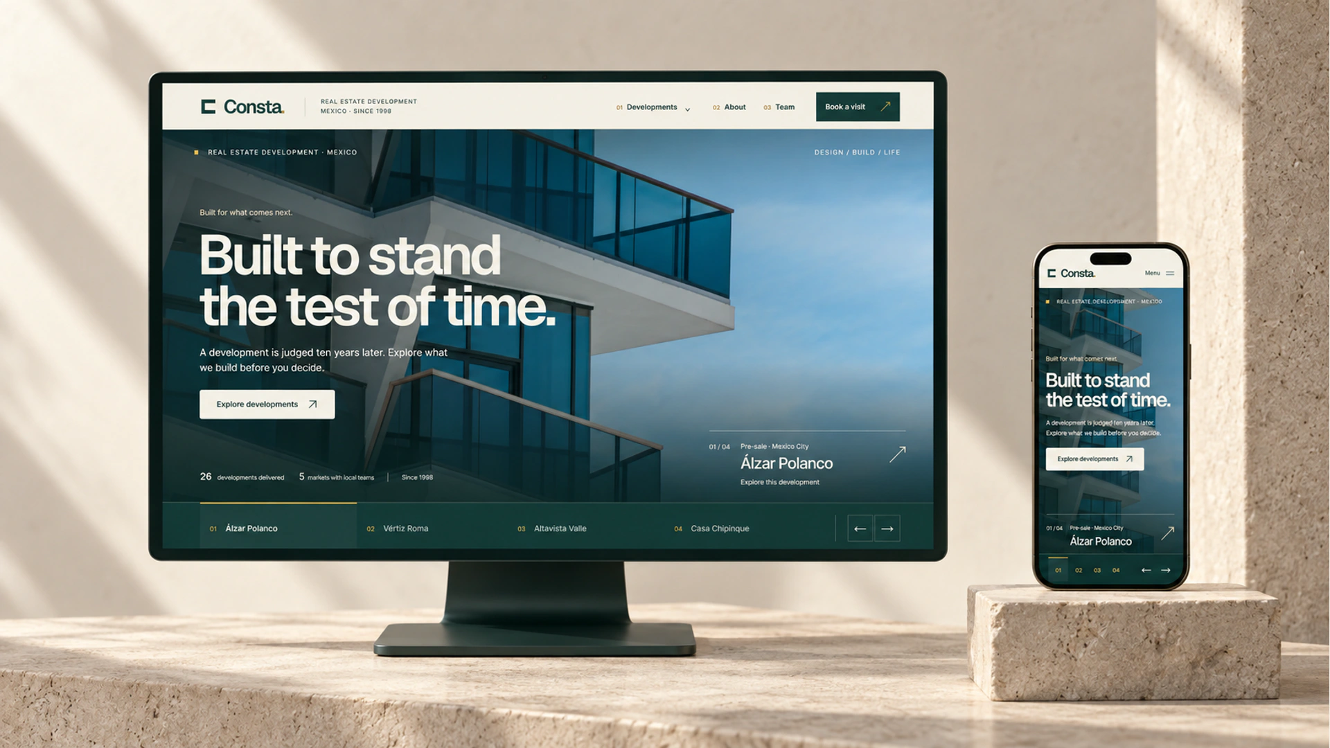
AI-assisted studio mockups explore the material identity. The interface studies above document the actual layouts.
Live result
Consta